Tailwind CSS v4 integration
Learn how to use Material UI with Tailwind CSS v4.
Overview
There are two steps to integrate Tailwind CSS v4 with Material UI:
- Configure the styles to generate with the
@layerdirective. - Set up the layer order so that
muicomes before theutilitieslayer, allowing Tailwind CSS classes to override Material UI styles.
The instructions below detail how to achieve this using common React frameworks.
Next.js App Router
To integrate Tailwind CSS v4 with Material UI in a Next.js App Router project, start by configuring Material UI with Next.js in the App Router integration guide. Then follow these steps:
- Enable the CSS layer feature in the root layout:
import { AppRouterCacheProvider } from '@mui/material-nextjs/v15-appRouter';

export default function RootLayout() {
  return (
    <html lang="en" suppressHydrationWarning>
      <body>
        <AppRouterCacheProvider options={{ enableCssLayer: true }}>
          {/* Your app */}
        </AppRouterCacheProvider>
      </body>
    </html>
  );
}
- Configure the layer order in the Tailwind CSS file:
@layer theme, base, mui, components, utilities;
@import 'tailwindcss';
Next.js Pages Router
To integrate Tailwind CSS v4 with Material UI in a Next.js Pages Router project, start by configuring Material UI with Next.js in the Pages Router integration guide. Then follow these steps:
- Enable the CSS layer feature in a custom
_document:
import {
  createCache,
  documentGetInitialProps,
} from '@mui/material-nextjs/v15-pagesRouter';

// ...

MyDocument.getInitialProps = async (ctx: DocumentContext) => {
  const finalProps = await documentGetInitialProps(ctx, {
    emotionCache: createCache({ enableCssLayer: true }),
  });
  return finalProps;
};
- Configure the layer order with the
GlobalStylescomponent—it must be the first child of theAppCacheProvider:
import { AppCacheProvider } from '@mui/material-nextjs/v15-pagesRouter';
import GlobalStyles from '@mui/material/GlobalStyles';

export default function MyApp(props: AppProps) {
  const { Component, pageProps } = props;
  return (
    <AppCacheProvider {...props}>
      <GlobalStyles styles="@layer theme, base, mui, components, utilities;" />
      {/* Your app */}
    </AppCacheProvider>
  );
}
Vite.js or any other SPA
To integrate Tailwind CSS v4 with Material UI in a Vite-based app, make the following changes in src/main.tsx:
- Pass the
enableCssLayerprop to theStyledEngineProvidercomponent. - Configure the layer order with the
GlobalStylescomponent.
import { StyledEngineProvider } from '@mui/material/styles';
import GlobalStyles from '@mui/material/GlobalStyles';

ReactDOM.createRoot(document.getElementById('root')!).render(
  <React.StrictMode>
    <StyledEngineProvider enableCssLayer>
      <GlobalStyles styles="@layer theme, base, mui, components, utilities;" />
      {/* Your app */}
    </StyledEngineProvider>
  </React.StrictMode>,
);
Tailwind CSS IntelliSense for VS Code
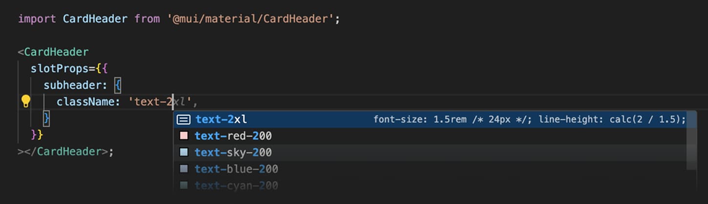
The official Tailwind CSS IntelliSense extension requires extra configuration to work properly when customizing the interior slots of Material UI components.
After installing the extension, add the following line to your VS Code settings.json file:
{
  // ...config
  "tailwindCSS.experimental.classRegex": [["className\\s*:\\s*['\"]([^'\"]*)['\"]"]]
}
Now you should see the autocomplete and syntax highlighting features when using the slotProps prop, as shown in the screenshot below:
Usage
- Use the
classNameprop to apply Tailwind CSS classes to the root element of the component. - Use
slotProps.{slotName}.classNameto apply Tailwind CSS classes to a component's interior slots.
Some important helper text
Extend Material UI classes
If you want to use Material UI theme tokens in your Tailwind CSS classes, copy the snippet below into your CSS file.
@layer theme, base, mui, components, utilities;
@import 'tailwindcss';

@theme inline {
  /* Material UI typography */
  --font-h1: var(--mui-font-h1);
  --font-h2: var(--mui-font-h2);
  --font-h3: var(--mui-font-h3);
  --font-h4: var(--mui-font-h4);
  --font-h5: var(--mui-font-h5);
  --font-h6: var(--mui-font-h6);
  --font-subtitle1: var(--mui-font-subtitle1);
  --font-subtitle2: var(--mui-font-subtitle2);
  --font-body1: var(--mui-font-body1);
  --font-body2: var(--mui-font-body2);
  --font-button: var(--mui-font-button);
  --font-caption: var(--mui-font-caption);
  --font-overline: var(--mui-font-overline);

  --letter-spacing-h1: -0.01562em;
  --letter-spacing-h2: -0.00833em;
  --letter-spacing-h4: 0.00735em;
  --letter-spacing-h6: 0.0075em;
  --letter-spacing-body1: 0.00938em;
  --letter-spacing-body2: 0.01071em;

  /* Material UI breakpoints */
  --breakpoint-sm: 37.5rem; /* 600px */
  --breakpoint-md: 56.25rem; /* 900px */
  --breakpoint-lg: 75rem; /* 1200px */
  --breakpoint-xl: 96rem; /* 1536px */
  --breakpoint-2xl: 120rem; /* 1920px */

  /* Material UI theme colors */
  --color-primary: rgb(var(--mui-palette-primary-mainChannel));
  --color-primary-light: rgb(var(--mui-palette-primary-lightChannel));
  --color-primary-dark: rgb(var(--mui-palette-primary-darkChannel));
  --color-primary-contrast: rgb(var(--mui-palette-primary-contrastTextChannel));

  --color-secondary: rgb(var(--mui-palette-secondary-mainChannel));
  --color-secondary-light: rgb(var(--mui-palette-secondary-lightChannel));
  --color-secondary-dark: rgb(var(--mui-palette-secondary-darkChannel));
  --color-secondary-contrast: rgb(var(--mui-palette-secondary-contrastTextChannel));

  /* Material UI status colors */
  --color-info: rgb(var(--mui-palette-info-mainChannel));
  --color-info-light: rgb(var(--mui-palette-info-lightChannel));
  --color-info-dark: rgb(var(--mui-palette-info-darkChannel));
  --color-info-contrast: rgb(var(--mui-palette-info-contrastTextChannel));

  --color-error: rgb(var(--mui-palette-error-mainChannel));
  --color-error-light: rgb(var(--mui-palette-error-lightChannel));
  --color-error-dark: rgb(var(--mui-palette-error-darkChannel));
  --color-error-contrast: rgb(var(--mui-palette-error-contrastTextChannel));

  --color-success: rgb(var(--mui-palette-success-mainChannel));
  --color-success-light: rgb(var(--mui-palette-success-lightChannel));
  --color-success-dark: rgb(var(--mui-palette-success-darkChannel));
  --color-success-contrast: rgb(var(--mui-palette-success-contrastTextChannel));

  --color-warning: rgb(var(--mui-palette-warning-mainChannel));
  --color-warning-light: rgb(var(--mui-palette-warning-lightChannel));
  --color-warning-dark: rgb(var(--mui-palette-warning-darkChannel));
  --color-warning-contrast: rgb(var(--mui-palette-warning-contrastTextChannel));

  /* Material UI text & common colors */
  --color-text-primary: rgb(var(--mui-palette-text-primaryChannel));
  --color-text-secondary: rgb(var(--mui-palette-text-secondaryChannel));
  --color-text-disabled: var(--mui-palette-text-disabled);
  --color-common-background: var(--mui-palette-common-background);
  --color-common-onBackground: var(--mui-palette-common-onBackground);
  --color-divider: var(--mui-palette-divider);

  /* Material UI background colors */
  --color-background-default: rgb(var(--mui-palette-background-defaultChannel));
  --color-background-paper: rgb(var(--mui-palette-background-paperChannel));

  /* Material UI action colors */
  --color-action-active: var(--mui-palette-action-active);
  --color-action-hover: var(--mui-palette-action-hover);
  --color-action-selected: var(--mui-palette-action-selected);
  --color-action-disabled: var(--mui-palette-action-disabled);
  --color-action-focus: var(--mui-palette-action-focus);

  /* Material UI gray scale */
  --color-gray-50: var(--mui-palette-grey-50);
  --color-gray-100: var(--mui-palette-grey-100);
  --color-gray-200: var(--mui-palette-grey-200);
  --color-gray-300: var(--mui-palette-grey-300);
  --color-gray-400: var(--mui-palette-grey-400);
  --color-gray-500: var(--mui-palette-grey-500);
  --color-gray-600: var(--mui-palette-grey-600);
  --color-gray-700: var(--mui-palette-grey-700);
  --color-gray-800: var(--mui-palette-grey-800);
  --color-gray-900: var(--mui-palette-grey-900);
  --color-gray-A100: var(--mui-palette-grey-A100);
  --color-gray-A200: var(--mui-palette-grey-A200);
  --color-gray-A400: var(--mui-palette-grey-A400);
  --color-gray-A700: var(--mui-palette-grey-A700);

  /* Material UI Component Colors */
  /* Alert */
  --color-Alert-error: var(--mui-palette-Alert-errorColor);
  --color-Alert-info: var(--mui-palette-Alert-infoColor);
  --color-Alert-success: var(--mui-palette-Alert-successColor);
  --color-Alert-warning: var(--mui-palette-Alert-warningColor);
  --color-Alert-errorFilled: var(--mui-palette-Alert-errorFilledBg);
  --color-Alert-infoFilled: var(--mui-palette-Alert-infoFilledBg);
  --color-Alert-successFilled: var(--mui-palette-Alert-successFilledBg);
  --color-Alert-warningFilled: var(--mui-palette-Alert-warningFilledBg);
  --color-Alert-errorFilledColor: var(--mui-palette-Alert-errorFilledColor);
  --color-Alert-infoFilledColor: var(--mui-palette-Alert-infoFilledColor);
  --color-Alert-successFilledColor: var(--mui-palette-Alert-successFilledColor);
  --color-Alert-warningFilledColor: var(--mui-palette-Alert-warningFilledColor);
  --color-Alert-errorStandard: var(--mui-palette-Alert-errorStandardBg);
  --color-Alert-infoStandard: var(--mui-palette-Alert-infoStandardBg);
  --color-Alert-successStandard: var(--mui-palette-Alert-successStandardBg);
  --color-Alert-warningStandard: var(--mui-palette-Alert-warningStandardBg);
  --color-Alert-errorIcon: var(--mui-palette-Alert-errorIconColor);
  --color-Alert-infoIcon: var(--mui-palette-Alert-infoIconColor);
  --color-Alert-successIcon: var(--mui-palette-Alert-successIconColor);
  --color-Alert-warningIcon: var(--mui-palette-Alert-warningIconColor);

  /* AppBar */
  --color-AppBar-default: var(--mui-palette-AppBar-defaultBg);

  /* Avatar */
  --color-Avatar-default: var(--mui-palette-Avatar-defaultBg);

  /* Button */
  --color-Button-inheritContained: var(--mui-palette-Button-inheritContainedBg);
  --color-Button-inheritContainedHover: var(
    --mui-palette-Button-inheritContainedHoverBg
  );

  /* Chip */
  --color-Chip-defaultBorder: var(--mui-palette-Chip-defaultBorder);
  --color-Chip-defaultAvatar: var(--mui-palette-Chip-defaultAvatarColor);
  --color-Chip-defaultIcon: var(--mui-palette-Chip-defaultIconColor);

  /* FilledInput */
  --color-FilledInput-bg: var(--mui-palette-FilledInput-bg);
  --color-FilledInput-hover: var(--mui-palette-FilledInput-hoverBg);
  --color-FilledInput-disabled: var(--mui-palette-FilledInput-disabledBg);

  /* LinearProgress */
  --color-LinearProgress-primary: var(--mui-palette-LinearProgress-primaryBg);
  --color-LinearProgress-secondary: var(--mui-palette-LinearProgress-secondaryBg);
  --color-LinearProgress-error: var(--mui-palette-LinearProgress-errorBg);
  --color-LinearProgress-info: var(--mui-palette-LinearProgress-infoBg);
  --color-LinearProgress-success: var(--mui-palette-LinearProgress-successBg);
  --color-LinearProgress-warning: var(--mui-palette-LinearProgress-warningBg);

  /* Skeleton */
  --color-Skeleton-bg: var(--mui-palette-Skeleton-bg);

  /* Slider */
  --color-Slider-primary: var(--mui-palette-Slider-primaryTrack);
  --color-Slider-secondary: var(--mui-palette-Slider-secondaryTrack);
  --color-Slider-error: var(--mui-palette-Slider-errorTrack);
  --color-Slider-info: var(--mui-palette-Slider-infoTrack);
  --color-Slider-success: var(--mui-palette-Slider-successTrack);
  --color-Slider-warning: var(--mui-palette-Slider-warningTrack);

  /* SnackbarContent */
  --color-SnackbarContent-bg: var(--mui-palette-SnackbarContent-bg);
  --color-SnackbarContent-text: var(--mui-palette-SnackbarContent-color);

  /* SpeedDialAction */
  --color-SpeedDialAction-fabHover: var(--mui-palette-SpeedDialAction-fabHoverBg);

  /* StepConnector & StepContent */
  --color-StepConnector-border: var(--mui-palette-StepConnector-border);
  --color-StepContent-border: var(--mui-palette-StepContent-border);

  /* Switch */
  --color-Switch-default: var(--mui-palette-Switch-defaultColor);
  --color-Switch-defaultDisabled: var(--mui-palette-Switch-defaultDisabledColor);
  --color-Switch-primaryDisabled: var(--mui-palette-Switch-primaryDisabledColor);
  --color-Switch-secondaryDisabled: var(--mui-palette-Switch-secondaryDisabledColor);
  --color-Switch-errorDisabled: var(--mui-palette-Switch-errorDisabledColor);
  --color-Switch-infoDisabled: var(--mui-palette-Switch-infoDisabledColor);
  --color-Switch-successDisabled: var(--mui-palette-Switch-successDisabledColor);
  --color-Switch-warningDisabled: var(--mui-palette-Switch-warningDisabledColor);

  /* TableCell */
  --color-TableCell-border: var(--mui-palette-TableCell-border);

  /* Tooltip */
  --color-Tooltip-bg: var(--mui-palette-Tooltip-bg);

  /* Material UI shadows */
  --shadow-1: var(--mui-shadows-1);
  --shadow-2: var(--mui-shadows-2);
  --shadow-3: var(--mui-shadows-3);
  --shadow-4: var(--mui-shadows-4);
  --shadow-5: var(--mui-shadows-5);
  --shadow-6: var(--mui-shadows-6);
  --shadow-7: var(--mui-shadows-7);
  --shadow-8: var(--mui-shadows-8);
  --shadow-9: var(--mui-shadows-9);
  --shadow-10: var(--mui-shadows-10);
  --shadow-11: var(--mui-shadows-11);
  --shadow-12: var(--mui-shadows-12);
  --shadow-13: var(--mui-shadows-13);
  --shadow-14: var(--mui-shadows-14);
  --shadow-15: var(--mui-shadows-15);
  --shadow-16: var(--mui-shadows-16);
  --shadow-17: var(--mui-shadows-17);
  --shadow-18: var(--mui-shadows-18);
  --shadow-19: var(--mui-shadows-19);
  --shadow-20: var(--mui-shadows-20);
  --shadow-21: var(--mui-shadows-21);
  --shadow-22: var(--mui-shadows-22);
  --shadow-23: var(--mui-shadows-23);
  --shadow-24: var(--mui-shadows-24);

  /* Material UI opacity */
  --opacity-activated: calc(100% * var(--mui-palette-action-activatedOpacity));
  --opacity-disabled: calc(100% * var(--mui-palette-action-disabledOpacity));
  --opacity-focus: calc(100% * var(--mui-palette-action-focusOpacity));
  --opacity-hover: calc(100% * var(--mui-palette-action-hoverOpacity));
  --opacity-selected: calc(100% * var(--mui-palette-action-selectedOpacity));

  /* Material UI overlays */
  --overlay-1: var(--mui-overlays-1);
  --overlay-2: var(--mui-overlays-2);
  --overlay-3: var(--mui-overlays-3);
  --overlay-4: var(--mui-overlays-4);
  --overlay-5: var(--mui-overlays-5);
  --overlay-6: var(--mui-overlays-6);
  --overlay-7: var(--mui-overlays-7);
  --overlay-8: var(--mui-overlays-8);
  --overlay-9: var(--mui-overlays-9);
  --overlay-10: var(--mui-overlays-10);
  --overlay-11: var(--mui-overlays-11);
  --overlay-12: var(--mui-overlays-12);
  --overlay-13: var(--mui-overlays-13);
  --overlay-14: var(--mui-overlays-14);
  --overlay-15: var(--mui-overlays-15);
  --overlay-16: var(--mui-overlays-16);
  --overlay-17: var(--mui-overlays-17);
  --overlay-18: var(--mui-overlays-18);
  --overlay-19: var(--mui-overlays-19);
  --overlay-20: var(--mui-overlays-20);
  --overlay-21: var(--mui-overlays-21);
  --overlay-22: var(--mui-overlays-22);
  --overlay-23: var(--mui-overlays-23);
  --overlay-24: var(--mui-overlays-24);
}

/* Material UI base styles */
@layer base {
  h1 {
    font: var(--mui-font-h1);
    letter-spacing: -0.01562em;
  }
  h2 {
    font: var(--mui-font-h2);
    letter-spacing: -0.00833em;
  }
  h3 {
    font: var(--mui-font-h3);
  }
  h4 {
    font: var(--mui-font-h4);
    letter-spacing: 0.00735em;
  }
  h5 {
    font: var(--mui-font-h5);
  }
  h6 {
    font: var(--mui-font-h6);
    letter-spacing: 0.0075em;
  }
  p {
    font: var(--mui-font-body1);
    letter-spacing: 0.00938em;
  }
  span {
    font: var(--mui-font-body2);
    letter-spacing: 0.01071em;
  }
}

/* Material UI typography utilities */
@utility typography-* {
  font: --value(--font- *);
}

/* Material UI overlay utilities */
@utility overlay-* {
  background-image: --value(--overlay- *);
}

/* Material UI elevation utilities */
@utility elevation-* {
  background-image: --value(--overlay- *);
  box-shadow: --value(--shadow- *);
}
Then you can start using the new classes—for example:
- The class
typography-h1producesfont: var(--mui-font-h1); - The class
text-primaryproducescolor: rgb(var(--mui-palette-primary-mainChannel));
So when you add these classes to an element…
<div className="typography-h1 text-primary">Hello world</div>
…the CSS looks like this:
@layer utilities {
  .typography-h1 {
    font: var(--mui-font-h1);
    letter-spacing: -0.01562em;
  }
  .text-primary {
    color: rgb(var(--mui-palette-primary-mainChannel));
  }
}
Playground
Visit the Tailwind CSS Playground to explore the classes from Material UI theme tokens.
Troubleshooting
If the Tailwind CSS classes are not overriding Material UI components, make sure that:
- You are using Tailwind CSS >= v4.
- You have configured the layer order correctly by checking the DevTools styles tab. The
muilayer should come before theutilitieslayer.